logo·type:
ˈlȯ-gə-ˌtīp, ˈlä-
1 : a single piece of type or a single plate faced with a term (such as the name of a newspaper or a trademark)
2 : an identifying symbol (as for use in advertising)
3 : an identifying statement : motto
Having graduated from the University of Washington with a Bachelor of Fine Arts in Graphic Design, now more commonly known as Visual Communication, I've had the opportunity to devise the visual identity for a number of interesting entrepeneurs. If you too would like to update or create your logo and accompanying style guide, don't hesitate to get in touch.
The video associaited here documents the process of combining type design and photography in the process of creating cover art illustration for a single release by the alt psyche rock outfit Nabucco Dinosaur.

7t
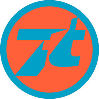
The “7t” (always lowercase t when spelled out) logo was inspired by that of Toho Co., Ltd., the Japanese film, theatre and distribution studio, most reknown for the Godzilla series as well as for the work of director Akira Kurosawa. It’s a mark that I developed to act as a signature for any of the film work and animations I’ve produced.
The associated video depicts an animated version utilized in either the opening or closing credits of a work.

Weymuller Photography
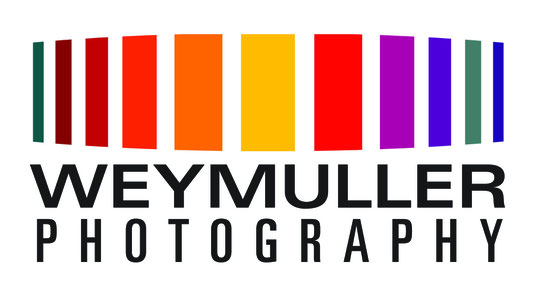
The multicolor columns of color and their seeming receding is meant to evoke a grove of trees as well as the curved ring of a single lens reflex camera aperture adjustor combined with the hues of a setting sunset in the wild.
"People and the essence of their being; isn't this ultimately what we hope to experience when we view images of our dear ones? Indeed, this is what I strive to capture, and what fuels my passion."
- E.A. Weymuller, III
Synapse Construction

“I just wanted to express my gratitude for the excellent work Synapse did for my home. The finished product exceeded my expectations. The constant professionalism, attention to detail, overall thoroughness, and willingness to accommodate unusual issues, on the fly, was a sigh of relief. ” - Ben D.
The jigsaw letterforms suggest the fitting of joints. The glowing, central, pyramidal form signifies the glow of solution resolution.
(Other logotype marks that I've designed that I will include in higher resolution once I locate the source files)
